Overview:
As the sole UX designer for my department within Amazon Web Services, I was responsible for facilitating consensus across teams and leaders in support of redesign of 7 disparate systems and countless web pages into one managed global portal.
I created and executed a new information architecture strategy, under which I designed a suite of content aggregation sites and dynamic applications. As a result, application usage rose 300% among our end users.
Opportunity: Frustration and Low Adoption of Tools
After a series of restructuring and rapid growth, AWS Worldwide Public Sector found itself with a large, complex web of digital tools for their global sales team.
Sales associates, to whom time is extremely important, were struggling to find relevant resources they needed for their work. Managers also noted a lack of adoption of any new tools that were launched or updated. Associates instead would rely on their managers to distill timely information and resources, resulting in extra effort and wasted time.


Process: Out with the Old, in with the New
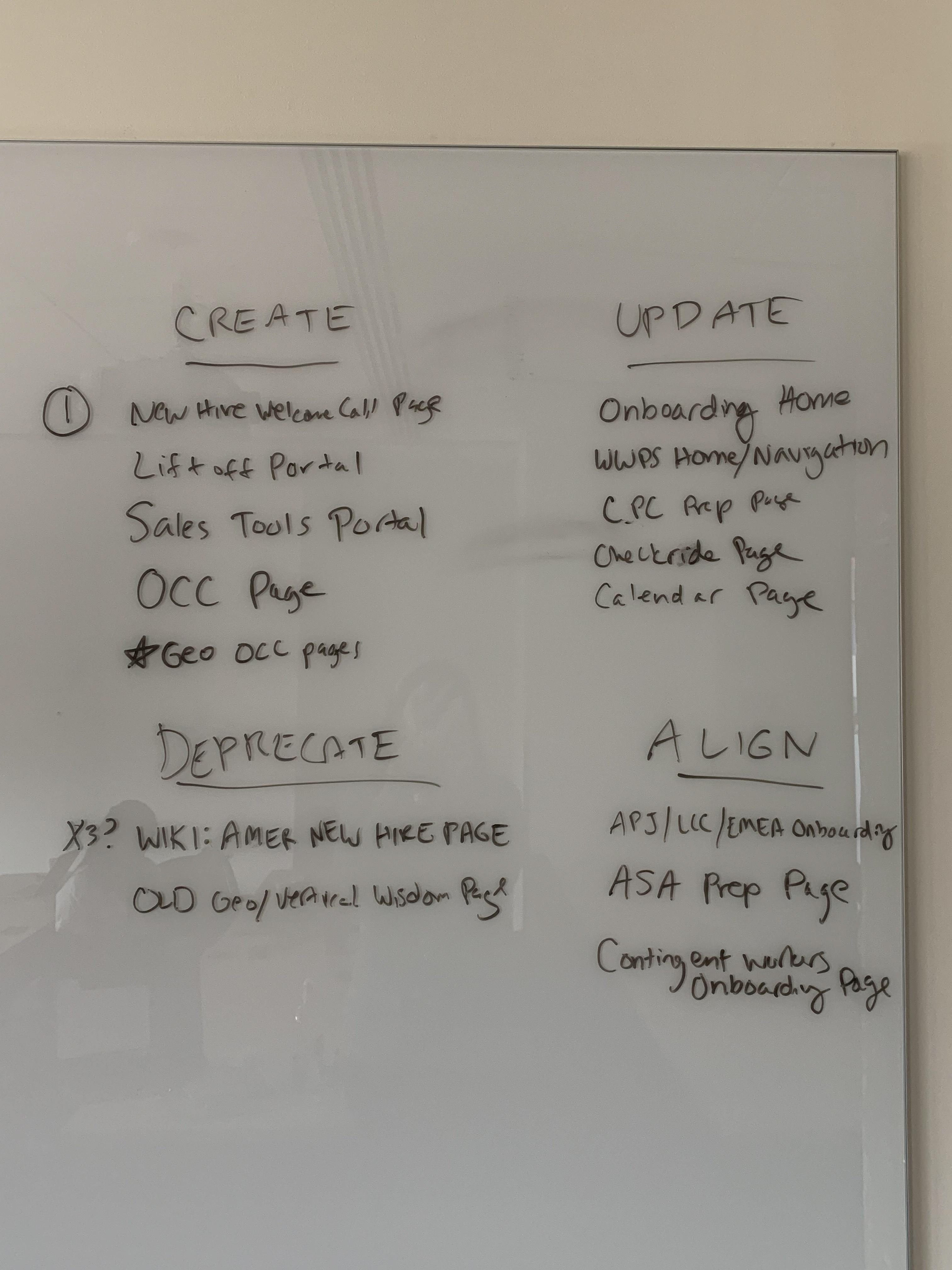
After defining a problem statement, I performed a holistic content audit, mapped out the current information architecture and learned the functionality for all the distinct platforms and systems.
I performed ad-hoc user research by informally interviewing sales associates. One of my main insights was that while there was a vital need for new tools, an equally critical issue was that outdated, irrelevant resources were not being deprecated or archived, so each new app linked to dead ends, leading frustrated users to distrust and abandon the network of resources completely.
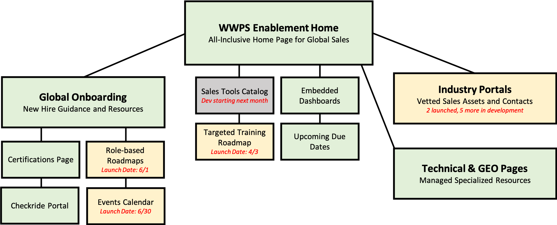
Based on this research, I prioritized the deprecation of all unmanaged resources while creating a combined roadmap/content map that was shared across the org to maintain visibility and gain buy-in.
To manage the change, I worked with global content owners to solve their major pain points and provided 1:1 coaching sessions, customizable templates, and centralized best practices.
Outcome: Less Frustration, More Utilization
Along with each project milestone, I publicized digestible reports in our monthly QBRs to demonstrate how the new strategy was performing.
During this project we deprecated entire platforms, centralized global content management, and streamlined processes, resulting in a 60% net reduction of total digital content, significantly decreasing user frustration and time spent searching for timely information and resources.
Because of this new logical organization of information, I was able to successfully design and launch a dynamic roadmap, catalog app, and a suite of industry content aggregator pages, and organize all of these applications into our new centrally managed portal. By the end of the project, digital tools usage/adoption had risen 300% among our sales end users.
Because of this new logical organization of information, I was able to successfully design and launch a dynamic roadmap, catalog app, and a suite of industry content aggregator pages, and organize all of these applications into our new centrally managed portal. By the end of the project, digital tools usage/adoption had risen 300% among our sales end users.
An Example Report