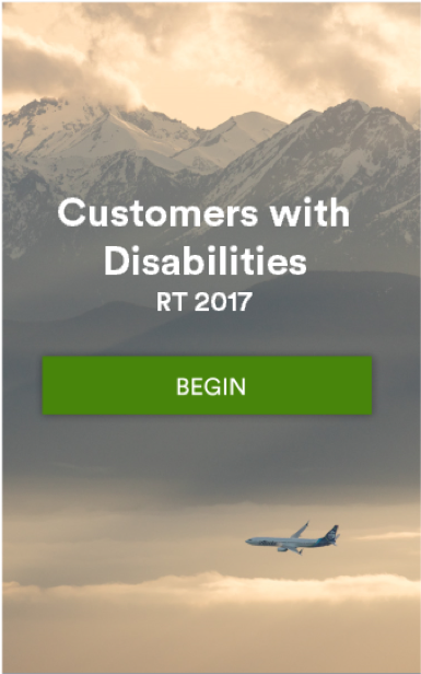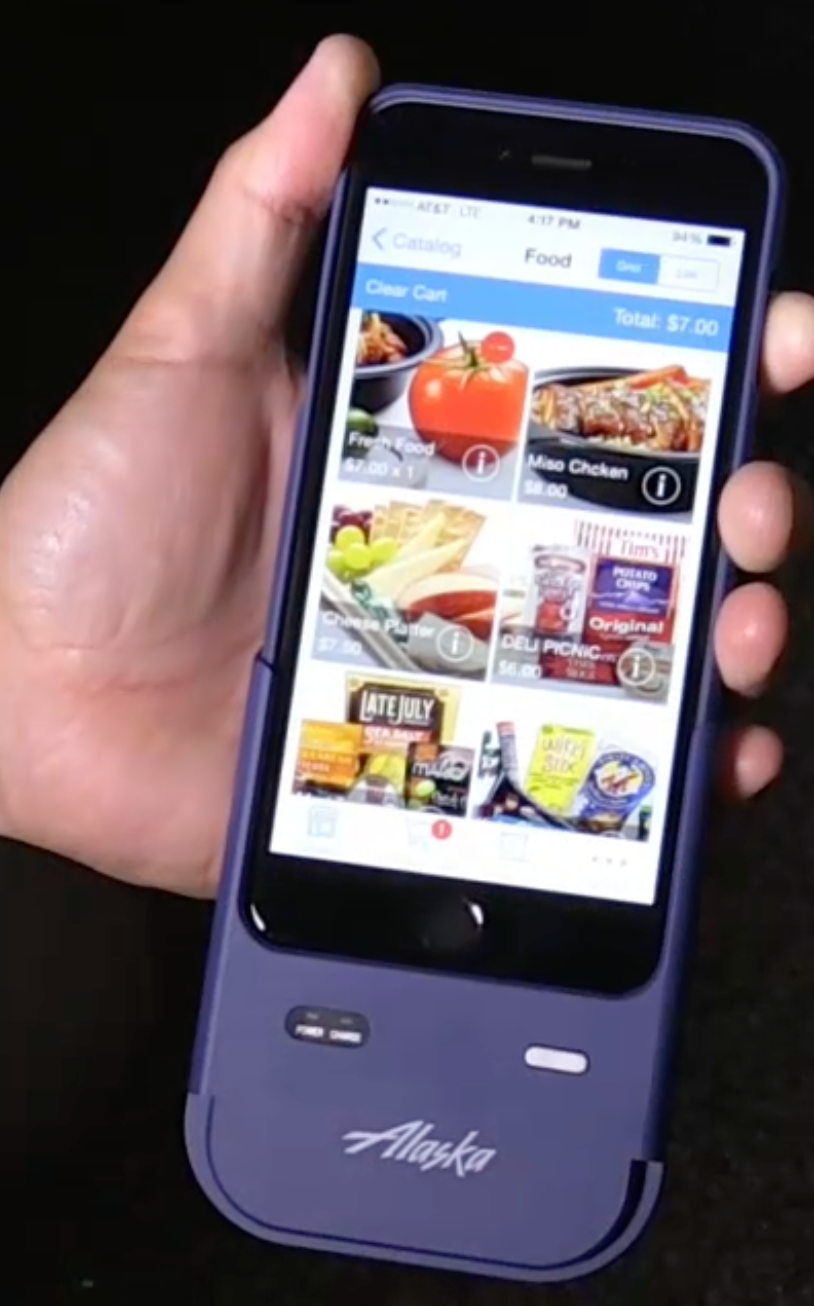

As a Lead Designer at Alaska Airlines, I designed, developed, and launched an app that granted 10,000 flight attendants the ability to complete required tasks on their mobile devices.
I drove this project from inception to completion and created the infrastructure and design systems to leverage as the mobile strategy matured.
As a result of a successful launch, the FAA certified our mobile strategy and we were subsequently able to design and launch operational and buy-on-board apps.
Opportunity: Solve pain points with mobile
At the time, because flight attendants work independently on airplanes, the only way FAA regulations and company procedures could be communicated and taught was through computer-based training.
However, flight attendants didn't have access to a computer on the job, and many didn't have one at home either, creating a pain point resulting in frustration and hours of tech support calls.
The arrival of company mobile devices for flight attendants created a huge opportunity. However, the only way mobile devices could be used for work is if these three stipulations were met:
• We could train the flight attendants effectively enough to pass an FAA audit
• We were able to design an app and create an effective mobile strategy
• There was widespread adoption of the mobile device
Working App Prototype
Process: Fly with the flight attendants
I gathered insights by shadowing flight attendants, interviewing them, having them test mockups, and notably by having conversations with them when they called for tech support.
I worked with a cross-functional product team and a group of subject matter experts to brainstorm and test strategies. We knew that not only did we have to create a workable solution and win over the workgroup, but we had to demonstrate to leadership that this was a priority to invest in for the long term.
Based on the insights from our user research and the goals of the project, we decided to create a working app prototype that would launch as a training course, function as a data collection method, and provide a test case for a mobile strategy.
Outcome: A mobile-first strategy
I extensively tested early iterations of the user flow with flight attendants. I designed the UX to be accessible, intuitive and easy to use with workflows that mirrored apps they already used, and welcoming language and imagery that resonated with the users.
The app was immediately adopted as a better solution to the needs of their role. After we launched the working prototype app and were able to track the results, we had the data to demonstrate mobile adoption to leadership. Ultimately the flight attendants passed the FAA audit, and the department adopted a mobile-first strategy. I continued to work on subsequent apps to improve the employee and customer experience.
As part of my presentation "Calm the Mobile Turbulence" at the DevLearn 2016 and DemoFest 2016 Conferences, I created this one-pager to summarize the outcomes from our prototype project: